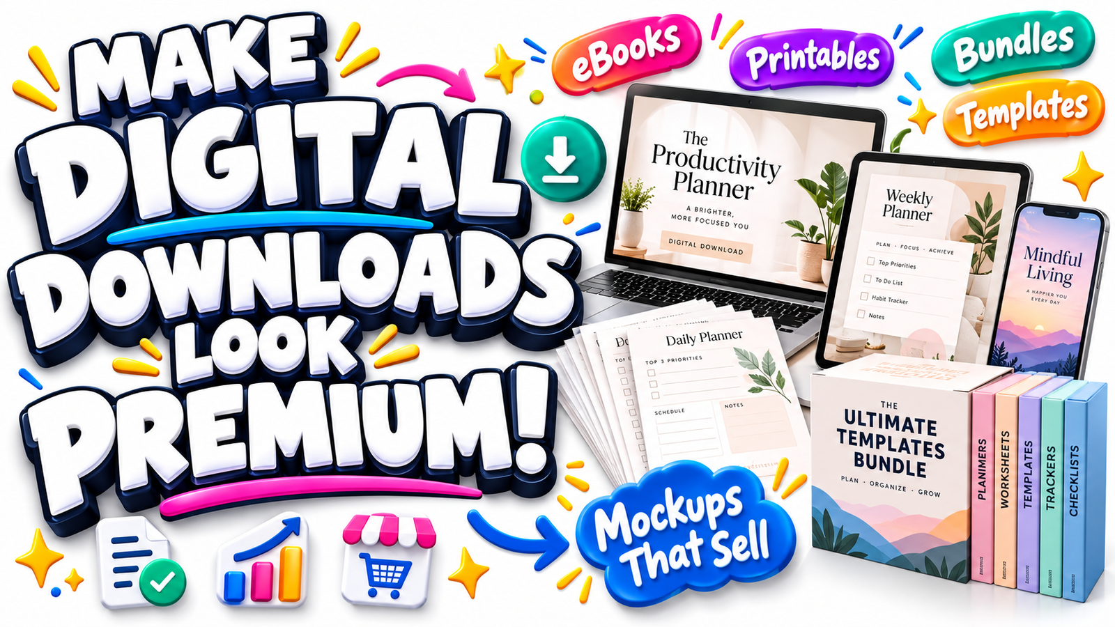
A customer cannot pick up a digital product.
They cannot feel the paper, turn the pages of a workbook, open a physical box, examine a planner on a desk, or hold a course bundle in their hands before buying it.
That creates one of the biggest challenges in selling digital downloads: how do you make something invisible feel real, useful, substantial, and worth paying for?
The answer is often better product presentation.
A strong digital product mockup transforms a plain PDF, Canva template, spreadsheet, eBook, printable, online course, prompt pack, or resource bundle into something shoppers can immediately understand.
Instead of showing a flat file icon and writing “50-Page Business Planner,” you can show selected pages arranged naturally on a desk.
Instead of advertising “Social Media Templates,” you can display those designs on a smartphone, tablet, laptop, and several individual preview cards.
Instead of simply stating that a bundle contains 100 resources, you can build a carefully organized bundle display that communicates quantity, variety, and usefulness within seconds.
That is the real purpose of a digital download mockup.
It is not decoration for the sake of decoration. It is visual communication.
Why Digital Products Often Look Less Valuable Than They Really Are
Physical products naturally communicate some degree of value.
A customer looking at a backpack can see its dimensions, pockets, fabric, color, shape, and construction. A buyer considering a cookbook can see the cover, thickness, page design, photography, and binding.
Digital products do not have those advantages.
A ZIP file containing 200 templates could be extremely valuable, but visually it is still only a file.
A professionally researched 100-page guide may appear no more impressive in a download folder than a three-page checklist.
That difference between actual value and perceived value is where digital product mockups become important.
Good presentation helps answer questions customers may be thinking without consciously asking:
What exactly will I receive?
How much content is included?
What does the product look like inside?
Where would I use it?
Is it professionally designed?
Does it look easy to use?
Does this feel worth the price?
The better your visuals answer those questions, the less imagination you require from the buyer.
What Is a Digital Product Mockup?
A digital product mockup is a visual representation showing how a downloadable product looks or might be used in a realistic context.
For example, an eBook can be displayed as a 3D book, on a tablet screen, or as several interior page previews.
A printable planner can appear on a clipboard beside a pen and calendar.
A spreadsheet template can be shown on a laptop screen with enlarged sections demonstrating dashboards, tables, or charts.
A social media kit might appear across smartphone screens, square post previews, story layouts, and content calendars.
The underlying product remains digital. The mockup gives it a visual form.
This makes the offer easier to understand and often more attractive to browse.
The Difference Between Attractive Mockups and Effective Mockups
An attractive mockup looks beautiful.
An effective mockup communicates something useful.
The best product presentation does both.
Imagine you sell a 75-page small-business planner.
One image shows a stylish notebook beside flowers and coffee. It is attractive, but the shopper still does not know much about the planner.
Another image shows the cover plus visible previews labeled through the actual page design: financial planning, monthly goals, expense tracking, customer research, marketing planning, and weekly priorities.
The second presentation communicates the product more clearly.
Your visuals should therefore have a purpose.
Every image should ideally answer a buying question, demonstrate a benefit, reveal product contents, or help the buyer imagine using the download.
Device Mockups: Make Digital Files Feel Usable
Device mockups are among the most effective product presentation ideas for products designed to be viewed or used digitally.
A laptop, tablet, desktop monitor, or smartphone instantly gives the customer context.
Consider a Canva template bundle.
A flat screenshot might look like a collection of colorful rectangles.
Place those templates inside realistic smartphone displays and the buyer immediately understands: “These are social media designs I can use on my phone or publish online.”
Device mockups work especially well for:
Digital planners, Notion templates, spreadsheets, presentation templates, online courses, website templates, Canva designs, social media kits, digital guides, membership resources, mobile wallpapers and software-related products.
Match the device to the actual use case.
If buyers will mainly use your product on a desktop computer, make the laptop or monitor prominent.
If the product is designed for tablets, show it on a tablet.
If customers are buying Instagram templates, mobile phone displays can communicate the concept quickly.
Relevance is more persuasive than randomly adding expensive-looking devices.
eBook and Guide Mockups: Show More Than the Cover
One of the easiest mistakes in digital publishing is showing only an eBook cover.
The cover may attract attention, but the interior often creates the buying confidence.
Suppose your product is called:
The 30-Day Digital Product Launch Workbook
A 3D book cover can establish the product identity.
But additional previews could reveal the introduction, worksheets, planning pages, checklists, launch calendar, tracking pages and selected exercises.
Now the shopper sees evidence of what is inside.
For eBooks, guides and workbooks, combine several presentation styles rather than relying on one image.
A strong presentation sequence might move from the cover to a 3D book preview, then open-page spreads, enlarged interior details, a device preview and finally a bundle-style summary of what customers receive.
This turns the listing into a visual product tour.
Printable Mockups: Put the Download Into a Real-Life Scene
Printable products benefit enormously from contextual presentation.
Think about the difference between showing a plain white worksheet against another white background and showing that worksheet printed cleanly on a desk beside a pencil.
The second image answers an important question:
What will this look like when I actually use it?
Printable scenes are useful for products such as planners, calendars, worksheets, classroom activities, checklists, habit trackers, meal planners, budgeting sheets, wedding printables and children’s learning resources.
The scene does not need to be complicated.
In fact, restrained scenes often work better.
A printable budget sheet might sit on a light desk beside a calculator and pen.
A children’s worksheet might appear beside a few age-appropriate learning supplies.
A wedding planner could be presented with tasteful stationery.
The supporting objects should reinforce the product’s purpose rather than compete with it.
Bundle Displays: Make Quantity Easy to Understand
Bundles create another visual challenge.
Imagine advertising:
500+ Digital Marketing Templates
Writing “500+” communicates quantity, but a shopper cannot realistically inspect 500 files from one image.
Your job is to create the impression of breadth while keeping the presentation understandable.
You might feature several representative template designs in the foreground, additional previews extending behind them, a laptop showing another section of the collection, a tablet displaying a dashboard, and a clearly visible summary of the major categories included.
The objective is not to place hundreds of tiny thumbnails on one graphic.
That usually creates clutter.
Instead, create visual abundance with hierarchy.
Show enough variation to communicate that the bundle is substantial, then use carefully chosen copy to explain the rest.
For example:
500+ Editable Templates
25 Content Categories
Canva-Friendly Designs
Commercial-Use Options
Instant Digital Access
Only make claims that genuinely apply to your product and licensing terms.
The Hero Image Should Explain the Offer in Seconds
Your primary product image deserves special attention because customers may decide whether to continue browsing based largely on that first impression.
Ask yourself what someone should understand within roughly the first few seconds.
The product type should be obvious.
The core benefit should be obvious.
The design should appear professional.
The image should create enough curiosity to encourage the shopper to view the next image or read the description.
For a digital planner, you could show a tablet displaying a polished planning page alongside several floating page previews.
For a business template bundle, a laptop might display the primary dashboard while supporting document and spreadsheet previews indicate the wider collection.
For an eBook, a bold cover can remain dominant while two or three interior page previews reveal additional substance.
Do not attempt to explain everything in the hero image.
Its job is to earn attention.
The following images can provide proof and detail.
Create a Visual Story Across Your Product Gallery
Rather than treating every product image independently, think of your gallery as a sequence.
The opening image creates interest.
The second image explains what the product is.
The next reveals what is included.
Another demonstrates how it is used.
Another highlights an important feature.
Another clarifies format, compatibility or dimensions.
A final visual might summarize the complete bundle.
This approach reduces uncertainty progressively.
A shopper who reaches the end of the gallery should understand the product far better than someone who viewed only the hero image.
That is particularly important for digital goods because customers cannot physically inspect them before purchase.
Show the Actual Product Whenever Possible
Mockups should strengthen reality, not replace it.
If you sell a planner, include genuine planner pages.
If you sell spreadsheets, show real dashboards or selected spreadsheet sections.
If you sell an eBook, provide authentic interior previews.
If your product includes editable templates, display actual templates from the bundle.
Beautiful presentation may attract the click, but genuine previews help build trust.
When possible, choose examples that demonstrate variety.
For a 100-template content bundle, showing ten nearly identical templates may unintentionally make the entire package seem repetitive.
Instead, reveal different layouts, formats, categories, visual styles or practical applications.
Before-and-After Presentation Can Communicate the Benefit
Some digital products solve highly visual problems.
These can benefit from before-and-after storytelling.
For example, if you sell professional presentation templates, show a simple unstructured slide beside a polished version created using the template.
A resume template seller could demonstrate how scattered information becomes professionally organized.
A business-planning system might show messy notes transforming into a structured planning dashboard.
The important point is accuracy.
Do not imply that purchasing your product automatically guarantees a business outcome, financial result, employment opportunity or other achievement that depends on factors beyond the product itself.
Show what the resource helps users create or organize.
That is usually both more trustworthy and more persuasive.
Use Scale and Layering to Increase Perceived Substance
Digital products often feel more substantial when buyers can visually see multiple components.
Layering is a useful technique.
Imagine a digital branding kit containing a workbook, templates, worksheets, checklists and social media graphics.
Rather than placing one representative image in the center, create a composition where the workbook anchors the scene while template cards, device screens and worksheet previews appear around it.
The customer’s eye sees multiple deliverables.
That visual structure can communicate depth better than writing a long paragraph describing every file.
However, avoid going too far.
When every item is enlarged, tilted, shadowed, labeled and competing for attention, the design loses hierarchy.
Choose one dominant element and let the remaining pieces support it.
White Space Can Make a Digital Product Look More Premium
Many sellers assume valuable-looking bundle images must contain as much content as possible.
The opposite can happen.
Crowded layouts often make products look cheaper because viewers struggle to identify the important information.
White space gives elements room to breathe.
It can make typography clearer, screenshots easier to understand and the primary product more prominent.
Premium presentation is often less about adding more objects and more about deciding what can safely be removed.
Make Text on Mockups Easy to Read
Text can help communicate quantity, category, compatibility and key features, but it must remain readable on mobile devices.
A beautiful mockup containing twenty lines of tiny text may become useless when viewed as a marketplace thumbnail.
Prioritize short, meaningful messages.
Instead of writing a complete product description into an image, communicate one main point at a time.
For example, one slide could focus on “100+ Editable Templates.”
Another could emphasize “Designed for Canva.”
Another could show “Instagram Posts + Stories + Covers.”
The full explanation belongs in your product page copy.
The images should support it.
Digital Download Mockups Should Match Your Brand
Consistency matters when customers encounter multiple products from the same seller.
Using similar typography, spacing, backgrounds, mockup angles, lighting and layout patterns can create a recognizable visual identity.
This is especially valuable for stores selling related products.
A cohesive shop often looks more established than a collection where every listing appears to come from a different brand.
You do not need every mockup to look identical.
You need a consistent design language.
Avoid Misleading Digital Product Mockups
Mockups should help buyers understand an offer, not create confusion about what they will receive.
If you show a laptop, tablet, notebook, pencil or smartphone only as a display prop, customers should not reasonably interpret those physical objects as included in the purchase.
Make it obvious that the product is digital where necessary.
Descriptions can clearly state:
Digital download only. No physical item will be shipped.
Likewise, avoid showing pages, templates, bonuses, quantities or features that are not actually included.
Long-term trust is more valuable than a short-term click.
Product Mockups and Conversion-Focused Copy Should Work Together
A mockup attracts the eye.
Copy explains the offer.
Your strongest product pages connect the two.
Suppose your image shows a business planner across a tablet and several printable pages.
Your supporting copy can immediately explain:
“Plan your goals, finances, marketing and weekly priorities in one organized digital planning system.”
Now the visual demonstrates the product while the copy communicates its purpose.
A useful CTA can follow naturally:
Explore the complete planner and preview what is included before you download.
Notice that the CTA does not simply say “Buy Now.”
It gives the customer a reason to continue.
CTA Ideas for Digital Product Sellers
Calls to action work best when they match the buyer’s stage of decision-making. Early in an article or product page, a low-pressure CTA such as Preview the Templates, See What’s Included, or Explore the Bundle can encourage further engagement. Near the purchase section, more direct language such as Get Instant Access, Start Using the Templates, or Download the Complete Bundle may be appropriate.
The best CTA completes the sentence already forming in the buyer’s mind.
“I understand this product. I can see how I would use it. I know what I will receive. Now I want to see the complete offer.”
SEO for Digital Product Mockups
If you are publishing product mockups on your own website, visual presentation and search visibility can work together.
Use descriptive filenames instead of meaningless names such as image1234.jpg.
A filename such as digital-product-mockup-business-planner.jpg gives the image useful context.
Write accurate alt text based on what the image actually contains.
Use descriptive surrounding copy.
Optimize images so they load efficiently.
Create useful page titles and headings around real customer search intent.
Potential semantic phrases include digital product mockup ideas, digital download mockup, digital product presentation, printable mockup, eBook mockup, Canva template mockup, digital bundle display, product listing images, digital product photography alternative, device mockup, digital planner mockup, and how to present digital products online.
Use these only where they fit naturally.
Google’s current people-first guidance emphasizes useful, substantial and original content rather than pages written mainly to manipulate rankings.
Designing for Google Discover and Visual Discovery
Highly visual articles about digital product design can also be suitable for interest-driven discovery when they genuinely help readers.
Google states that indexed content meeting Discover policies is automatically eligible for Discover; no special Discover tag or structured data is required, and eligibility does not guarantee placement. Google recommends accurate headlines instead of misleading clickbait, useful and timely content, compelling relevant images, and a strong overall page experience.
For Discover imagery, Google currently recommends images at least 1200 pixels wide, with high resolution and a landscape-friendly presentation such as 16:9. Publishers can enable large image previews with max-image-preview:large, and Google says schema.org image information or og:image can help indicate a preferred representative image. Google also advises against generic or excessively text-heavy preferred images.
For a WordPress article on digital product mockups, that means your featured image should ideally communicate the subject visually before someone reads the headline.
For example, show an attractive laptop, tablet, eBook, printable pages and bundle elements in one clean composition rather than filling the entire image with promotional text.
Google’s Article structured-data guidance also recommends relevant, crawlable high-resolution imagery and suggests supplying useful image variants such as 16:9, 4:3 and 1:1 when appropriate.
GEO: Make Your Content Easy for Search and AI Systems to Understand
Generative Engine Optimization, commonly called GEO, should not mean writing robotic content for machines.
Clear writing works better for humans too.
Give important questions direct answers.
Define important concepts close to where they first appear.
Use descriptive headings.
Explain why recommendations matter.
Include concrete examples rather than vague claims.
Connect related terms naturally.
For example, instead of repeatedly writing “digital product mockup,” explain the individual categories surrounding the topic: device mockups, printable scenes, workbook previews, template presentations, eBook displays, bundle graphics and product listing images.
This creates richer topical context while avoiding keyword stuffing.
A Practical Digital Product Mockup Framework
A strong listing can be built around seven presentation goals: attention, identification, contents, demonstration, benefits, reassurance and action.
Start with a strong hero image that attracts attention.
Immediately clarify what the product is.
Show enough real contents to prove substance.
Demonstrate how customers can use the product.
Communicate practical benefits.
Remove uncertainty around file formats, compatibility and delivery.
Then give the shopper a clear next step.
This framework works whether you sell one PDF or a collection containing thousands of digital resources.
Example: Presenting a Digital Business Bundle
Imagine you are selling:
The Complete Small Business Starter Kit
It includes an eBook, financial spreadsheet, business planner, marketing templates, social media calendar and customer research worksheets.
A weak presentation might display one generic folder icon with the bundle title.
A stronger presentation could make the eBook the centerpiece, show the financial dashboard on a laptop, place the business planner on a tablet, display several social media templates as floating cards and reveal selected worksheet pages in the foreground.
Now the customer can visually decode the bundle.
The next image could focus exclusively on the spreadsheet.
Another could preview planner pages.
Another could demonstrate the marketing templates.
Another could summarize all included resources.
The product itself has not changed.
The customer’s understanding of the product has.
That is the power of presentation.
Frequently Asked Questions
1. What is the best mockup for a digital product?
The best mockup depends on how the product will actually be used. Device mockups are effective for digital planners, online courses, dashboards and templates. Printed desk scenes work well for printable products. 3D books and interior page previews are useful for eBooks and workbooks. Large bundles usually benefit from layered displays showing several representative components.
2. Do digital product mockups help increase sales?
Mockups cannot guarantee sales, but they can make a product easier to understand and evaluate. Clear visuals can show customers what they will receive, how a product can be used and how much material is included. Better understanding may reduce hesitation during the buying process.
3. How many mockup images should a digital product listing have?
There is no universal number that works for every marketplace or product. Use enough images to answer the customer’s important buying questions without repeating the same information. A more complex bundle usually needs more visual explanation than a simple one-page printable.
4. What should I include in a digital download mockup?
Show representative content from the actual product, the intended use environment and the most important features. Depending on the product, this may include device screens, interior pages, worksheets, dashboards, templates, file categories, format information and bundle components. Avoid adding visual elements that could mislead buyers about what is included.
5. How can I make digital product mockups look more professional?
Use clear hierarchy, realistic proportions, consistent shadows, readable typography, generous spacing and a limited number of supporting objects. Most importantly, make the actual product the visual focus. Professional mockups do not need to be complicated; they need to communicate clearly.
Turn an Invisible Download Into a Product People Can Picture Using
Digital products do not have shelves, packaging, boxes or physical displays.
Sellers have to create that context themselves.
A thoughtful digital product mockup bridges the gap between an invisible download and a tangible buying experience. Device mockups help customers picture digital use. Book previews reveal depth. Printable scenes demonstrate real-world applications. Bundle displays communicate quantity and variety.
The goal is not to make a downloadable product pretend to be physical.
The goal is to make its value easier to see.
Show buyers what they are getting.
Show them enough of the actual product to build confidence.
Show how it fits into their work, business, learning, planning or creative process.
Then make the next action simple.
Ready to improve your product presentation? Review your current listing and replace the image that explains the least with a mockup that answers one important customer question. Small presentation improvements can make an entire digital offer easier to understand, explore and buy.
Stay ahead with exclusive updates
Join our community. Get curated industry trends, actionable guides, and fresh resources delivered straight to your inbox.