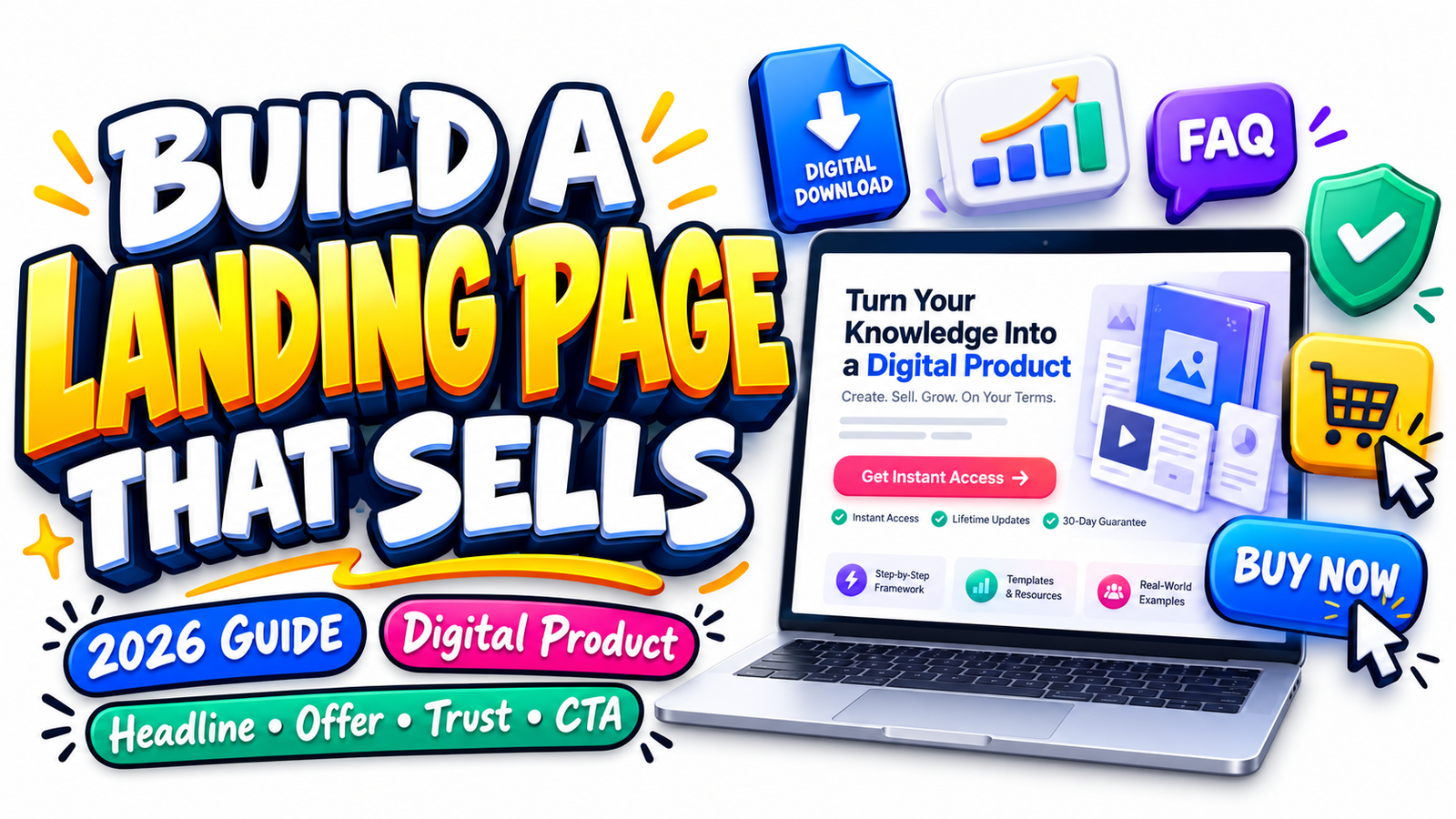
SEO Title: How to Create a High-Converting Digital Product Landing Page in 2026
Meta Description: Learn how to create a high-converting digital product landing page in 2026 with better headlines, offer clarity, product previews, benefits, trust elements, FAQs, CTAs, SEO and GEO optimization.
Selling a digital product is easy in one sense: there is no warehouse to manage, no parcel to pack, and no physical product to ship.
Convincing someone to buy it is another matter.
When customers cannot pick up a product, inspect its materials, turn it around, or test it in person, your landing page has to do that work for them. It must make an invisible product feel understandable, useful, credible and worth paying for.
That is why a successful digital product landing page in 2026 is much more than a beautiful sales page.
It is your product demonstration, salesperson, FAQ desk, credibility layer, search landing page and checkout bridge working together.
Whether you sell an eBook, online course, Canva template, spreadsheet, printable, AI prompt bundle, PLR product, digital planner, membership, business toolkit or downloadable resource, the same question is running through the buyer’s mind:
“Is this exactly what I need, and do I trust this enough to buy it?”
A high converting product page answers that question quickly and continues answering it as the visitor scrolls.
This guide explains how to build one.
What Makes a Digital Product Landing Page Different in 2026?
The modern buyer arrives with more information and less patience.
A visitor might discover your product through Google Search, Google Discover, social media, YouTube, Pinterest, an email newsletter, an AI-generated recommendation or a conversational search query.
Google itself says people are increasingly using generative AI features to find, compare and understand information. In 2026, Google reported that AI Mode had surpassed one billion monthly users globally, while search behavior was becoming increasingly conversational.
That changes what an effective landing page needs to accomplish.
The page needs to communicate the product clearly to a human visitor while also giving search engines and AI systems enough structured, meaningful information to understand what the product is, who it is for, what problem it addresses and what someone receives after purchasing.
This is where traditional conversion optimization, SEO and GEO — generative engine optimization — begin to overlap.
The objective is not to write for machines.
The objective is to make the page so clear, specific and useful that humans and machines can understand it without guessing.
Google’s current guidance continues to emphasize helpful, reliable, people-first content rather than pages created primarily to manipulate search rankings.
That principle should guide your entire landing page.
1. Begin With an Offer That Can Be Understood in Seconds
Before designing buttons, mockups or testimonials, fix the offer itself.
A weak offer cannot be rescued by attractive web design.
Someone arriving on your digital download landing page should be able to identify almost immediately what the product is, who it is designed for and what useful result it helps them achieve.
Compare these two approaches.
A weak headline might say:
“The Ultimate Business Toolkit”
It sounds impressive, but it tells the customer almost nothing.
A clearer version might say:
“50 Ready-to-Use Client Management Templates for Freelancers Who Want to Organize Projects, Payments and Follow-Ups Faster.”
Now the reader understands the product category, quantity, target audience and practical purpose.
Clarity usually converts better than cleverness because uncertainty creates hesitation.
Your opening section should communicate four things: what the product is, who it is for, the main outcome it supports and what the buyer receives.
For example:
Plan Your Content Without Starting From a Blank Page
Get a 12-month content planning system with editable calendars, campaign worksheets and publishing trackers designed for freelancers, creators and small businesses.
Instant digital download. Editable Canva and PDF files included.
That gives the visitor a reason to continue scrolling.
2. Write a Headline Around the Customer’s Desired Outcome
Your headline is not the place to explain every feature.
Its job is to create immediate relevance.
Good digital product headlines usually combine an audience, problem, desired result or distinguishing feature.
The strongest version depends on what the buyer already knows.
If the visitor already understands the problem, emphasize the solution.
If the product category is unfamiliar, emphasize what it is.
If competing products look similar, emphasize the distinction.
Instead of:
“Social Media Template Pack”
consider:
“Create a Month of Professional Social Content Without Designing Every Post From Scratch.”
Instead of:
“Budget Spreadsheet”
consider:
“A Simple Small-Business Budget Dashboard That Shows Where Your Money Is Going.”
The supporting subheadline can then explain the product itself.
Search visibility matters here too. Google recommends using words people actually search for in prominent places such as the title and main heading.
That means you can naturally combine persuasive writing with search intent.
A title such as “Digital Product Landing Page Template for Canva Sellers” can be both clear to buyers and understandable to search systems.
Avoid stuffing multiple keyword variations into the headline. One natural phrase is more useful than a sentence that sounds engineered for search robots.
3. Make the Above-the-Fold Section Do the Heavy Work
The first screen should answer the visitor’s most urgent questions without requiring a long scroll.
An effective hero area normally contains the main headline, supporting explanation, visual representation of the product, important buying information and one obvious call to action.
If the product is $29, do not make visitors search for the price.
If it is a digital download, say so.
If Canva is required, say so.
If the buyer receives 75 templates, say so.
If commercial-use rights are included, define them.
A visitor should not need to investigate your website simply to understand the transaction.
Mobile layout matters particularly here. A design that looks impressive on a desktop monitor can become frustrating when the CTA disappears beneath oversized graphics on a phone.
Check whether the headline remains readable, product preview loads quickly, price is visible, button is easy to tap and important information does not require excessive scrolling.
Conversion design starts with reducing effort.
4. Show the Digital Product Instead of Merely Describing It
One of the biggest weaknesses of digital-product sales pages is that they sell an invisible product with vague promises.
The solution is visual proof.
If you are selling an eBook, show several interior pages rather than only the cover.
If you are selling templates, show the templates being used.
If you are selling spreadsheets, show the dashboards, charts or worksheets.
If you are selling a course, show the student dashboard, lesson organization and representative lesson previews.
If you are selling printable worksheets, display readable samples.
If you are selling an AI prompt library, show a small selection of genuine prompt examples and what they help accomplish.
Your goal is to reduce imagination.
The less the buyer has to imagine, the easier the purchase decision becomes.
Product previews can include flat screenshots, device mockups, page spreads, before-and-after demonstrations, short videos, animated walkthroughs or examples created using the product.
Avoid filling the page with decorative mockups that reveal nothing about what customers actually receive.
A beautiful laptop mockup is useful only if the screen helps visitors understand the product.
5. Sell Benefits Without Hiding the Features
“Benefits, not features” is common marketing advice, but taken too literally it can make a landing page vague.
Digital buyers usually want both.
They want to understand what they receive and why it matters.
Suppose you are selling a pack of 100 editable social media templates.
The feature is:
100 editable Canva templates.
The practical benefit is:
You can start with an existing professional layout instead of designing every post from zero.
The broader outcome might be:
Maintain a more consistent publishing routine while reducing repetitive design work.
Those statements perform different jobs.
Features make the product tangible. Benefits translate those features into usefulness. Outcomes help the customer imagine the improved situation.
Use all three.
Avoid promising guaranteed revenue, guaranteed rankings, instant success or unrealistic transformations unless you can genuinely substantiate the claim.
Credibility is a conversion asset.
6. Include a Clear “What You Get” Section
Digital products often suffer from unclear scope.
A person buys a bundle expecting editable files and discovers only PDFs are included. Another expects commercial rights but receives personal-use rights. Someone else assumes a course includes coaching when it does not.
Prevent this before checkout.
Tell customers exactly what the purchase contains.
For example, instead of saying “Complete Creator Bundle,” explain that the bundle includes a 90-page PDF guide, 45 editable Canva templates, 12 planning worksheets, 20 caption frameworks, lifetime access to the purchased files and future updates only where explicitly stated.
Also explain file formats, approximate file sizes where relevant, software requirements, how delivery works, language, compatibility, access duration and licence conditions.
That section performs an important conversion function:
It transforms an abstract offer into a concrete purchase.
7. Explain Who the Product Is For
A page becomes more persuasive when readers recognize themselves.
Instead of claiming that a product is “perfect for everyone,” identify realistic audiences.
A content calendar might be designed for bloggers, freelancers, social media managers, coaches and small-business owners.
A children’s printable pack might be intended for parents, homeschoolers, tutors or educators, depending on the actual licence.
A PLR bundle might suit digital sellers who are permitted to adapt and resell the included products under the specific licence terms.
Specificity creates relevance.
It can also help search visibility because natural audience phrases add semantic context around the product.
Long-tail searches such as “digital planner for freelance designers,” “editable Canva business templates for coaches,” or “digital download landing page for printable sellers” reveal stronger intent than extremely broad keywords.
Do not force these phrases into every paragraph. Use them when they genuinely describe the product.
8. Address the Customer’s Main Objections Before Asking for the Sale
Every purchase comes with questions.
The difference between a weak landing page and a high converting digital product page is often whether those questions are answered before uncertainty becomes an exit.
Common digital-product objections include:
“Will this work with my software?”
“Can I edit it?”
“How do I receive the files?”
“Is this beginner-friendly?”
“Is this a subscription?”
“What licence is included?”
“Can I use this commercially?”
“What happens if I lose my files?”
“Are future updates included?”
“Can I request a refund?”
Do not bury critical conditions inside legal pages while making the sales copy intentionally vague.
Clear expectations reduce misunderstandings and can improve customer satisfaction after purchase.
9. Use Trust Elements That Actually Mean Something
Trust badges alone do not create trust.
Real trust comes from evidence.
Useful trust elements for a digital product landing page can include authentic customer testimonials, sample pages, creator credentials, transparent business information, clear support information, secure payment information, realistic product demonstrations, licence details, privacy information and an understandable refund or digital-delivery policy.
When displaying testimonials, specificity is more valuable than generic praise.
“This was amazing!” provides little information.
A testimonial explaining that a freelancer used a particular spreadsheet to organize invoices is more useful because it gives the visitor context.
Never manufacture testimonials or imply results that did not occur.
If you do not yet have customers, use transparency rather than fake social proof. Strong previews, detailed explanations and a clear creator story can provide meaningful confidence while the product is new.
10. Give the Price Context
Price should not appear as an unexplained number.
Help customers understand what is included.
For example:
$19 One-Time Purchase
Includes 60 editable templates, PDF instructions, immediate access after checkout and personal/commercial usage according to the included licence.
This is clearer than displaying only:
$19 — Buy Now
If discounts are genuine, explain them accurately. Avoid permanently displaying artificial countdown timers, manufactured scarcity or inflated “original” prices that were never genuinely charged.
Pressure can occasionally produce a click.
Trust produces a business.
11. Design Calls to Action Around the Buying Decision
Your primary CTA should be unmistakable.
“Learn More” is often weak on a sales page because the customer already is learning more.
More specific button language can communicate what happens next:
Get the Template Pack
Download the Planner
Get Instant Access
Buy the Complete Toolkit
Start the Course
A longer landing page should normally repeat the CTA at logical decision points rather than showing it only once.
Good locations include the hero section, after the benefits or product-content explanation, after social proof and near the bottom of the page.
The surrounding copy matters as much as the button.
A CTA becomes stronger when nearby text answers the final practical concern.
For example:
Get the Complete Toolkit
One-time payment • Instant digital access • No subscription
The purpose is not to place buttons everywhere.
The purpose is to make the next step obvious whenever the visitor becomes ready.
12. Use FAQs as a Conversion Tool, Not Page Filler
A strong FAQ section handles uncertainty that remains after the primary sales argument.
Do not add questions merely because every landing-page template includes FAQs.
Use questions customers genuinely ask before buying.
For a downloadable Canva template, questions about Canva accounts, editing, printing, delivery and commercial licences are useful.
For an online course, questions about lesson duration, access period, prerequisites, certificates and support may matter more.
Clear FAQ wording can also support SEO and GEO because conversational questions resemble the way people increasingly search through AI-powered and traditional search experiences.
The answer should appear directly after the question and explain the issue in straightforward language.
Do not force keyword-heavy paragraphs underneath every question.
Helpfulness comes first.
13. Build the Page for SEO Without Destroying the Sales Experience
A sales page does not have to choose between conversion and search visibility.
It needs sensible optimization.
Start with a descriptive page title that reflects what the page actually sells.
Google says title links are an important way users understand what a result contains and recommends concise, descriptive title text rather than vague wording.
A page selling a digital wedding planner could use a title such as:
Editable Digital Wedding Planner Template | Brand Name
rather than:
Amazing Ultimate Product — Buy Now
Use your primary keyword naturally in the H1, opening copy and appropriate sections.
Add related language where relevant, such as digital download, downloadable template, instant download, editable template, online resource, digital product, product bundle, printable, licence, commercial use or other terms that genuinely match the product.
Use descriptive image filenames and meaningful alt text.
Add internal links from relevant articles and category pages.
Make important links crawlable. Google specifically recommends standard links with descriptive anchor text so its systems can understand and discover connected pages.
Write a useful meta description, but remember that Google may generate a different search snippet based on the query and on-page content.
Avoid creating hundreds of nearly identical product pages merely to target slightly different keywords.
Each page should have a real reason to exist.
14. Use Product Structured Data Where Appropriate
Structured data can help search engines understand product information.
For pages where customers can purchase a product, Google’s Product structured-data documentation includes merchant-listing options that can communicate information such as pricing, availability and other product details when applicable.
Structured data does not guarantee a rich result or a ranking increase.
Think of it as clearer machine-readable information, not a ranking shortcut.
The visible page content should still contain the important information customers need.
Do not put claims into structured data that visitors cannot verify on the actual page.
15. Optimize the Landing Page for GEO and AI Search
GEO is best approached as clarity optimization rather than a collection of tricks.
AI systems need understandable passages from which they can identify what a product does.
A page becomes easier to interpret when it contains direct statements such as:
“The Freelance Finance Dashboard is an editable Google Sheets template designed to help freelancers track income, expenses, invoices and monthly cash flow.”
That sentence identifies the entity, format, audience and purpose immediately.
Compare it with:
“Everything you need to transform the way you manage your future.”
The second version might sound more dramatic, but it communicates almost nothing.
For better AI-search comprehension, clearly define the product, answer common customer questions, maintain consistent product naming, explain terminology, demonstrate genuine expertise and include unique information that is not simply copied from competitors.
Google’s people-first content guidance encourages original information, substantial coverage and first-hand expertise rather than pages that simply summarize what already exists.
That principle also makes sense for GEO.
Specific information is easier to understand, quote, summarize and trust than generic promotional language.
16. Think Differently About Google Discover
Google Discover can be valuable, but it should not be treated as guaranteed traffic.
Google explicitly states that being eligible for Discover does not guarantee that content will appear there, and Discover traffic can be less predictable than keyword-driven search traffic.
For sellers, a useful strategy is often to create high-quality informational content related to the product and use that content to introduce interested readers to the landing page.
For example, instead of relying only on a page selling a content planner, publish a useful article such as:
“How to Build a 90-Day Content Plan Without Posting Every Day.”
The article can naturally demonstrate the planning system and link readers to the product.
For Discover-oriented content, Google currently recommends relevant, compelling large images that are at least 1200 pixels wide, high resolution and suitable for a 16:9 presentation. Google also recommends enabling max-image-preview:large and says site owners can identify a preferred image through supported metadata such as og:image or schema.org markup.
Importantly, Google’s current Discover documentation advises avoiding text-heavy preferred images.
That means your Discover strategy should not depend entirely on promotional graphics packed with sales copy.
Use a visually strong, relevant image that remains understandable on a small mobile screen.
Google also recommends headlines that accurately capture the content and warns against misleading clickbait or sensational preview tactics.
A curiosity-driven headline can still work.
It simply needs to deliver what it promises.
17. Improve Page Speed and Mobile Experience
A beautiful sales page that feels slow can lose customers before its persuasion has a chance to work.
Large product mockups, video backgrounds, unnecessary animations, multiple font files and oversized plugins can quickly turn a simple landing page into a heavy page.
Compress images while maintaining useful quality.
Lazy-load non-critical images.
Avoid automatically playing large video files.
Keep the checkout route simple.
Test the page on an actual phone rather than checking only the desktop editor’s mobile preview.
Make sure visitors can read text without zooming and tap buttons without struggling.
Google recommends providing an overall strong page experience rather than focusing on a single ranking factor in isolation.
For a commercial page, that recommendation aligns with conversion goals as well.
Faster, simpler pages create less friction.
18. Remove Distractions That Compete With the Sale
Landing pages often become less effective as their creators continue adding elements.
A popup appears.
Then a notification bar.
Then social-media icons.
Then an animated chatbot.
Then a second popup.
Then advertisements.
Then five navigation menus.
Each addition competes for attention.
A visitor who arrived with buying intent should have a simple path:
Understand the product.
Evaluate the product.
Trust the seller.
Answer concerns.
Purchase.
Anything that repeatedly pulls the visitor away from that sequence deserves scrutiny.
Minimal design does not mean boring design.
It means visual hierarchy.
Make the product important, the message understandable and the buying action obvious.
19. Measure What Visitors Actually Do
Conversion optimization does not stop when the page is published.
Track meaningful behavior.
Look at product-page visits, CTA clicks, checkout starts, completed purchases, mobile-versus-desktop performance, traffic source and conversion rate.
Search Console can help you identify search queries, impressions and clicks bringing visitors to the page.
If eligible Discover traffic appears, Google provides a Discover performance report showing impressions, clicks and CTR when the site meets the reporting threshold.
Analytics can reveal where the commercial journey breaks.
A page receiving substantial traffic but few CTA clicks may have an offer-clarity problem.
Many CTA clicks but few checkout completions can indicate checkout friction, unexpected pricing, payment concerns or technical problems.
A high conversion rate with very little traffic suggests you may need stronger acquisition rather than more redesign.
Measure before changing everything.
20. Test One Important Variable at a Time
Conversion improvement becomes difficult to understand when you change the headline, pricing, hero image, CTA, page length and checkout simultaneously.
Test meaningful variables independently where practical.
Try a benefit-led headline against a product-led headline.
Test a flat product screenshot against a realistic product-in-use visual.
Compare CTA language.
Improve the explanation surrounding the price.
Move a strong testimonial closer to the purchase section.
Add missing product previews.
Clarify confusing licence information.
The purpose of testing is not to endlessly redesign the page.
It is to discover which uncertainty is preventing qualified buyers from acting.
A Simple High-Converting Digital Product Landing Page Structure
A practical page can begin with a clear headline and subheadline, followed immediately by the product visual, price and primary CTA.
The next section can explain the customer’s problem and show how the product addresses it.
Then demonstrate what the buyer receives using genuine screenshots or samples.
Translate important features into practical benefits.
Explain who the product is designed for.
Show credible testimonials, examples or other trust signals where available.
State the price, licence terms and delivery details clearly.
Answer important objections in the FAQ section.
Then provide a simple closing CTA that summarizes the offer without introducing a completely new promise.
That structure works because the page follows the questions naturally forming in the customer’s mind.
What is this?
Is it for me?
What do I get?
How will it help?
Can I trust it?
What does it cost?
What happens after I buy?
When your landing page answers those questions clearly, selling feels less like pressure and more like helping someone make an informed decision.
Frequently Asked Questions
1. What should a digital product landing page include?
A strong digital product landing page should include a clear headline, concise explanation of the offer, product previews, price, features, practical benefits, information about who the product is for, what files or resources are included, trust elements, delivery details, licence information where relevant, FAQs and a prominent call to action. The exact structure should reflect the questions customers need answered before buying.
2. How can I make a digital product landing page convert better?
Start by improving clarity rather than immediately changing the design. Make sure visitors quickly understand what the product is, who it is designed for and what they receive. Then strengthen visual previews, remove unnecessary distractions, explain benefits alongside features, answer objections, display transparent pricing and place clear CTAs at logical decision points. Use analytics and customer feedback to identify the largest areas of friction.
3. How long should a high-converting product page be?
There is no universal ideal length. A simple $5 printable might need far less explanation than a $500 professional course. The page should be long enough to answer the customer’s important questions without repeating the same promise unnecessarily. Google also says there is no preferred word count that content must reach simply for search ranking purposes.
4. Can a digital download landing page rank on Google?
Yes, a digital download landing page can be indexed and appear in search when it meets Google’s requirements and is relevant to a user’s query, but no optimization can guarantee a particular ranking. Use descriptive titles and headings, unique product information, useful text, crawlable links, relevant images, appropriate structured data, strong page experience and natural search terminology. Supporting the page with helpful related articles can also build stronger topical context.
5. How should I optimize a digital product page for SEO and AI search in 2026?
Write primarily for the customer while making the information easy for search and AI systems to interpret. Clearly state the product name, type, audience, purpose, format, price, important features and limitations. Use natural keyword variations, descriptive headings, direct FAQ answers, meaningful internal links, useful product images and accurate structured data where appropriate. Add original expertise, examples and first-hand insight instead of publishing generic copy that could describe hundreds of competing products.
Build a Landing Page That Makes Buying Easier
The best digital product landing pages do not win because they use the loudest headline, the brightest button or the greatest number of marketing tricks.
They win because they reduce uncertainty.
The customer understands the offer.
They can see the product.
They understand what is included.
They recognize the benefit.
They know who created it.
They understand the price.
Their questions have been answered.
And when they decide the product is right for them, the next action is obvious.
That is the foundation of a high-converting digital product landing page in 2026.
Conversion optimization, SEO, GEO and user experience are not separate goals when implemented properly. They all benefit from the same core principles: clear communication, useful information, real evidence, strong visual presentation and respect for the reader.
Build the page for the person making the purchase decision first.
Then make that useful information easy for search engines and AI systems to discover and understand.
That combination gives your digital download landing page a stronger foundation for organic visibility, qualified traffic, customer confidence and sustainable digital-product sales.
Stay ahead with exclusive updates
Join our community. Get curated industry trends, actionable guides, and fresh resources delivered straight to your inbox.