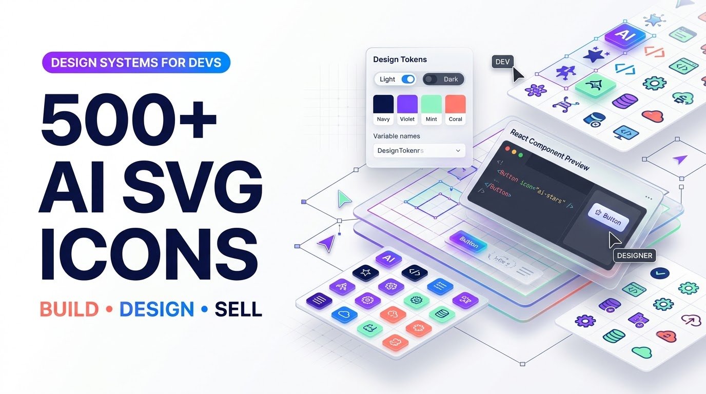
Learn to create and sell 500+ consistent AI-assisted SVG icons, Figma UI token kits, and React icon bundles with practical design and pricing strategies.
Design Systems for Devs: Creating AI-Generated SVG Icon Sets and Cohesive UI Asset Tokens
Stop stitching together mismatched icons. Learn how to build, quality-check, package, and sell a consistent 500+ icon library developers can actually ship.
Picture this: you are finishing a promising app. The onboarding screens look polished, but the search icon feels too heavy, the settings icon is oddly rounded, and the checkout symbol looks as if it came from another decade. You spend an hour replacing icons instead of shipping the product. Multiply that frustration across hundreds of interfaces and one opportunity becomes clear: developers do not just need more icons. They need fewer design inconsistencies.
That is the real product behind SVG icon packs for developers: a reliable visual language, supplied in formats that work with actual development workflows. With AI-assisted ideation, vector editing, design tokens, and automated testing, a solo creator can build an icon system that feels intentional rather than assembled.
This guide explains how to turn that idea into a sellable design asset: from draft sketches and precise SVG path geometry to a Figma UI token kit, React components, distribution files, product listings, and a responsible commercial license.
Why a Consistent SVG Icon Library Can Be More Valuable Than 500 Random Graphics
Individual icons are abundant. Consistency is scarce, particularly when an app requires symbols for payments, analytics, user profiles, notifications, security, navigation, and niche workflows. A founder may find a beautiful search icon for free and still waste time searching for 40 matching companions.
A cohesive clean vector icon set download solves a different problem: it protects the interface from style drift. Stroke widths, corner shapes, negative space, cap styles, visual metaphors, naming conventions, and token values are intentionally connected.
Named SVG files and framework components reduce repetitive import and cleanup work.
Every icon follows the same design grid, optical size, and stroke conventions.
Shared tokens and versioned assets make recoloring and future extensions manageable.
Practical niche examples: fintech dashboards need account, identity, card, risk, and payment icons; healthcare scheduling tools need appointment and navigation symbols; SaaS admin panels need role, status, automation, and reporting symbols. Choose a specific buyer before deciding which 500 icons to draw.
1. Overcoming AI’s Vector Limitations: From Image Generation to Production-Ready SVG
AI image generators can suggest visual directions quickly, but their output is often raster-based, visually inconsistent, or full of irregular edge geometry. Renaming a PNG to .svg does not make it a true vector asset. And even automatic tracing can create hundreds of unnecessary nodes, jagged corners, closed gaps, and shapes that render poorly at small sizes.
The reliable five-stage workflow
- Define the design grammar first. Set the grid, stroke width, cap style, corner rules, and allowed perspective before generating concepts.
- Use AI for concepts, not unchecked final geometry. Generate reference sheets for categories such as navigation, productivity, finance, and communication.
- Redraw or trace deliberately. Use Figma, Inkscape, Illustrator, or an appropriate vector editor; simplify curves and eliminate redundant points.
- Normalize path geometry. Align endpoints, correct circle geometry, standardize viewboxes, and verify optical centering.
- Test at realistic sizes. Render each icon at 16, 20, 24, and 32 pixels, inspect dark and light backgrounds, and run an SVG validation/optimization pass.
Example: a clean, theme-aware SVG
This simple search icon uses a 24 × 24 viewBox, a consistent stroke, rounded ends, no hardcoded theme color, and an accessible label when used as a standalone meaningful image.
<svg xmlns="http://www.w3.org/2000/svg"
  viewBox="0 0 24 24" width="24" height="24"
  fill="none" stroke="currentColor"
  stroke-width="1.75" stroke-linecap="round"
  stroke-linejoin="round" role="img"
  aria-label="Search">
  <circle cx="10.8" cy="10.8" r="6.8" />
  <path d="m16 16 4.1 4.1" />
</svg>
For a decorative icon next to readable button text, use aria-hidden="true" instead of an accessible name. Accessibility depends on context, not merely on the file format.
Quality control before exporting
Run an SVG optimizer such as SVGO using a reviewed configuration. Strip unwanted editor metadata and unsafe or unnecessary content without breaking semantic IDs or clipping paths. Compare optimized output visually to the original. Avoid blindly flattening strokes: some buyers want editable lines, while others need outlined paths for predictable rendering.
2. The Design Grammar: How 500 Icons Look Like One Family
The hardest part of a large icon pack is not drawing the five-hundredth symbol. It is ensuring that icon number 500 still belongs beside icon number 1.
| Design rule | Example baseline | What it prevents |
|---|---|---|
| Artboard | 24 × 24 units | Uneven scaling and alignment |
| Primary stroke | 1.75 units | Mixed visual weight |
| Stroke cap/join | Round / round | Inconsistent end treatments |
| Safe area | Approximately 2-unit inset, adjusted optically | Clipped or crowded symbols |
| Radius family | 2, 4, and 6 units where appropriate | Arbitrary corners |
| Perspective | Flat orthographic for the baseline pack | Accidental 3D/2D mixing |
| Color | currentColor for monochrome variants | Hardcoded light-theme colors |
These are suggested standards, not universal requirements. A 16-pixel micro-icon collection may benefit from a different grid or stroke. Whatever specification you choose, document it clearly and apply it across the entire pack.
Optical alignment matters more than mathematical centering
A circular icon may appear smaller than a square inside identical bounding boxes. A diagonal arrow may look off-center even when its geometry is precisely centered. Review icons together at actual display sizes rather than relying on coordinate measurements alone.
Create a reference board with 20 difficult shapes: circles, diagonals, tiny details, open contours, filled shapes, badges, and symbols with internal negative space. If these icons look harmonious, the rules are likely strong enough to scale.
3. Building a Figma UI Token Kit with Light and Dark Modes
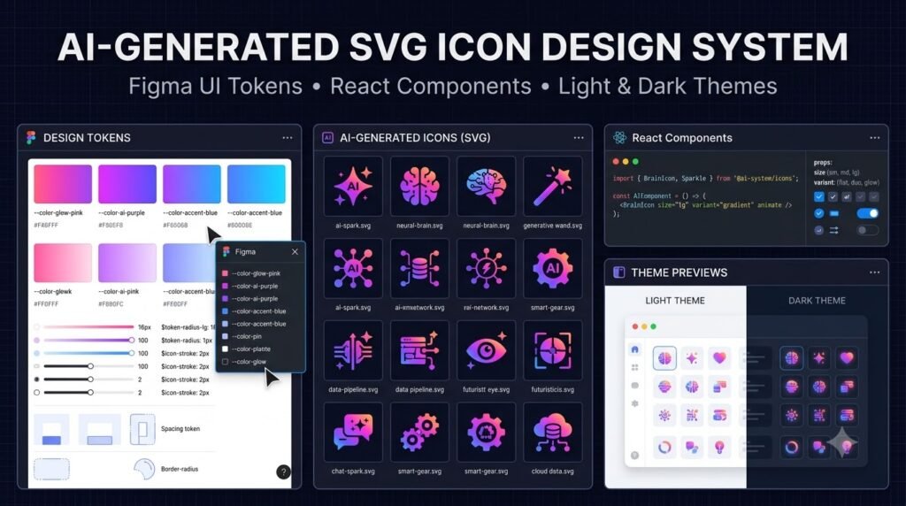
Design tokens turn a pack of standalone SVG files into an adaptable interface resource. Rather than storing a color such as #2563EB in each component, a token stores its purpose—like icon.default or icon.accent—and each theme supplies the appropriate value.
Figma variables support reusable values and modes for different visual contexts, including light and dark themes. Document exactly how your token names map from Figma into CSS, JSON, and application components.
| Semantic token | Light mode | Dark mode | Intended use |
|---|---|---|---|
icon.default | #1E293B | #E2E8F0 | Normal interface icons |
icon.muted | #475569 | #CBD5E1 | Secondary visual controls |
icon.accent | #3656E8 | #9BB0FF | Selected actions and emphasis |
icon.success | #087F70 | #54D6BA | Positive states, with text/status backup |
icon.danger | #B42318 | #FF978C | Error and destructive-action cues |
These values form a starter palette, not a guarantee of WCAG contrast in every setting. Test icon contrast against its actual background, and do not rely on color alone to communicate meaning.
CSS design token example
:root {
  --icon-default: #1e293b;
  --icon-muted: #475569;
  --icon-accent: #3656e8;
  --icon-success: #087f70;
}
[data-theme="dark"] {
  --icon-default: #e2e8f0;
  --icon-muted: #cbd5e1;
  --icon-accent: #9bb0ff;
  --icon-success: #54d6ba;
}
.app-icon {
  color: var(--icon-default);
  width: 1.5rem;
  height: 1.5rem;
}
For token portability, maintain a source-of-truth JSON export, ideally aligned with the Design Tokens Community Group format, then generate CSS and other platform files from that source. Verify import and export support against your team’s current Figma plan and version.
4. Packaging the Product: Raw SVG, Figma, React, and CSS
When shoppers search for a buy consistent app icon bundle solution, their preferred format usually depends on who is implementing the design. A polished download should remove format friction rather than force buyers to do conversions.
✦ Raw SVG + PNG previews
viewBox values. Include organized categories, searchable filenames, an index manifest, and optional high-resolution PNG previews for browsing. Keep SVG as the actual vector source.✦ Figma components and variables
✦ React / TypeScript components
.tgz package produced using npm pack for licensed customers.✦ CSS and icon-font maps
A sensible folder structure
cohesive-icon-system/
  LICENSE.txt
  README.md
  CHANGELOG.md
  icons/
    navigation/
    commerce/
    analytics/
    communication/
  figma/
    import-and-library-guide.pdf
  react/
    package.json
    src/
    dist/
  tokens/
    tokens.json
    light.css
    dark.css
  previews/
    contact-sheet.png
    icon-catalog.pdf
Only include files that you genuinely deliver. A Figma guide is not a substitute for the actual component library, and a React folder does not make the pack an installable package until its build and exports are tested.
A small React implementation example
import type { SVGProps } from 'react';

export function SearchIcon(
  props: SVGProps<SVGSVGElement>
) {
  return (
    <svg viewBox="0 0 24 24" fill="none"
      stroke="currentColor" strokeWidth="1.75"
      strokeLinecap="round" strokeLinejoin="round"
      aria-hidden="true" {...props}>
      <circle cx="10.8" cy="10.8" r="6.8" />
      <path d="m16 16 4.1 4.1" />
    </svg>
  );
}
This version assumes the surrounding control has an accessible name—for example, a button labeled “Search.” Meaningful standalone images need an accessible name instead. Buyers appreciate a short usage guide explaining the distinction.
5. Product Quality Assurance: What Professional Buyers Expect
Make quality measurable. Before publication, test for duplicate names, broken XML, unwanted embedded scripts, unexpected external references, missing icons in documentation, inconsistent dimensions, and visually unreadable small-size renders.
- Automated integrity: Parse every SVG, validate allowed tags and attributes, and check naming conventions.
- Visual snapshots: Compare contact sheets at 16, 20, and 24 pixels after each release.
- Theme previews: Check light, dark, high-contrast, selected, hover, disabled, and focused contexts when relevant.
- Dependency hygiene: Test the React build and document supported runtime versions rather than advertising universal compatibility.
- Documentation: Include license scope, file inventory, changelog, usage examples, and a support contact.
6. How to Monetize a 500+ SVG Icon and Design Token System
You are not selling the mathematical properties of vector lines. You are selling a dependable library, a documentation system, developer convenience, and saved design effort. Pricing should reflect those outcomes and the support responsibilities attached to each license.
| Illustrative product tier | Suggested starting price | Included deliverables | Buyer |
|---|---|---|---|
| Starter | $19–$39 | 100–150 SVG icons, previews, documentation | Students, hobbyists, small prototypes |
| Developer | $49–$99 | 500+ SVG files, React components, category manifests, CSS tokens | Indie developers and SaaS teams |
| Designer Pro | $99–$179 | Developer tier plus Figma components, variable themes, source assets | UI designers and product teams |
| Agency / Extended | $199–$399+ | Documented expanded usage rights, team seats or client-work allowances, defined updates | Agencies and multi-product teams |
These amounts are hypothetical positioning examples, not verified marketplace averages or promises of profit. Validate through competitor research, buyer interviews, and test purchases.
Where to sell
Creative Market: useful for design-focused shoppers looking for visual assets. Review seller eligibility, current fee arrangements, quality rules, and licensing obligations directly with the marketplace.
UI8: a design-resource marketplace relevant to polished interface kits. Confirm current contributor acceptance, product requirements, and rights terms before building your launch around it.
Your own storefront: allows direct positioning around developer needs, deeper documentation, tailored license options, and an email relationship with customers. You must manage checkout, taxes, delivery, support, and compliance.
A strong listing can lead with “500+ consistent SVG icons with React components and Figma theme tokens” rather than merely “large SVG graphics bundle.” The former describes a use case and what buyers actually receive.
Three high-intent sales hooks
- For solo builders: “Ship your interface without hunting down mismatched icons.”
- For designers: “One icon grammar. Hundreds of reusable symbols. One token-based workflow.”
- For agencies: “Keep client interfaces consistent with documented, reusable assets and clear commercial rights.”
Retain buyers with versioned updates
Publish a roadmap showing which categories may expand next. Offer optional updates, a changelog, compatibility notes, and feedback voting. Avoid promising perpetual updates unless you can sustain them. A free sample of 15–25 icons, accompanied by a short token guide, can help visitors evaluate quality before buying.
Build a UI asset library developers want to reuse
Start with a free sample icon set, show a complete working component, then invite readers to explore your documented full bundle. Replace the link below with your actual product or waitlist destination before publishing.
Explore Developer & AI Product Guides →7. A Practical 30-Day Launch Blueprint
| Period | Focus | Deliverable |
|---|---|---|
| Days 1–5 | Buyer interviews, niche selection, reference board, design grammar | Positioning brief + 20 reference icons |
| Days 6–12 | Draw and normalize core categories, develop naming and tests | First 100–150 validated icons |
| Days 13–20 | Scale production and audit geometry, add token themes | 500+ tested SVGs + token specification |
| Days 21–25 | Prepare Figma, React, CSS, previews, docs and licensing | Developer-ready distribution bundle |
| Days 26–30 | Beta feedback, preview page, marketplace listings, email launch | Published product with support plan |
This schedule is ambitious for a solo creator. Reduce the initial scope rather than sacrificing quality; launching 120 exceptional icons with a clear expansion plan can be more credible than claiming 500 poorly reviewed assets.
8. SEO and Buyer-Intent Strategy for a Developer Asset Store
Use distinct landing pages that answer different user goals: a tutorial for “how to create SVG icons with AI,” a product comparison for “best consistent icon libraries for React,” and a commerce page for “buy consistent app icon bundle.” Avoid publishing many thin pages that only swap keyword phrases.
Build trust with real screenshots, a live sample, exact file counts, supported versions, genuine customer feedback with permission, and transparent licensing. Google Discover visibility and trending-search placement cannot be guaranteed by adding keywords; relevant original content, compelling but accurate titles, helpful visuals, and a fast mobile experience are more defensible priorities.
Recommended search-keyword clusters
| Keyword class | Suggested searches | Intent |
|---|---|---|
| Primary | SVG icon packs for developers; Figma UI token kit | Discover and evaluate a solution |
| Secondary | React SVG icon components; design token library; consistent vector UI icons | Implementation research |
| Long-tail | 500 SVG icons with React components; editable icon pack with dark mode tokens; professional app icon bundle for SaaS dashboards | Specific product evaluation |
| Buyer intent | buy consistent app icon bundle; commercial SVG icon license; clean vector icon set download | Purchase readiness |
| Semantic / AEO | viewBox, currentColor, optical alignment, variable modes, SVGO, tree shaking, SVG accessibility | Educational and implementation answers |
Returning-reader idea: publish a short follow-up series: “SVG Optimization Checklist,” “Design Tokens in Figma vs CSS,” and “React Icon Package Release Guide.” Link each resource contextually so readers can deepen their skills without navigating a sales maze.
Frequently Asked Questions (5 FAQs)
1. Can AI-generated images be converted into production-quality SVG icons?
2. What should a professional 500+ SVG icon pack include?
3. Are Figma design tokens the same as CSS variables?
4. Can I sell AI-assisted SVG icon packs commercially?
5. Where should beginners sell an SVG and React icon bundle?
Test Your Knowledge: 5 Interactive Flashcard Quizzes
Choose your answer mentally, then open each flashcard to reveal the explanation.
Flashcard 1 · Does changing a PNG extension to .svg create editable vector paths?
Flashcard 2 · Which SVG color value automatically inherits the surrounding text color?
Flashcard 3 · Why can two mathematically centered icons appear visually misaligned?
Flashcard 4 · What is the main benefit of semantic design tokens?
icon.accent token can map to different values in light and dark themes without changing every icon individually.Flashcard 5 · Which bundle is stronger: 500 untested SVGs or 150 documented and validated icons?
From AI Experiments to a Reusable Design Product
The strongest icon businesses do not compete only on volume. They compete on consistency, ease of implementation, documentation, and confidence. AI can accelerate exploration, but the product earns its place in a developer’s workflow through deliberate vector craftsmanship and repeatable quality assurance.
Begin with a narrow audience, document the visual grammar, create a small excellent sample, and let genuine buyer feedback guide expansion. A cohesive icon system should feel invisible once installed: every symbol belongs, every theme works, and the team can return to building its product.
Your next action: Create 20 reference icons on one grid, export them as SVGs, test them at 16 and 24 pixels, and publish a free sample with a clear roadmap toward the full library.
Compliance, Licensing & Accessibility Note
AI and intellectual property: Review each model provider’s current commercial terms. Human editing does not automatically guarantee copyright protection, ownership, or non-infringement. Avoid imitating protected brand marks or distinctive proprietary icons, and maintain records of sources and editorial changes.
Third-party assets: Do not repackage purchased or open-source icons without explicitly verifying redistribution and sublicensing rights. A license permitting use inside an app may not permit resale as a standalone asset library.
Marketplace rules: Creative Market, UI8, Figma, and software package registries have their own policies, which may change. Confirm product eligibility, licensing, fees, and distribution restrictions with the service directly.
Security and accessibility: Sanitize contributed SVGs before use, review embedded content and references, avoid unnecessary scripts, test contrast and keyboard interactions, and apply meaningful labels only when appropriate. Follow applicable accessibility and privacy requirements.
Marketing and earnings: Example prices, timelines, and promotional copy are illustrative. Sales, rankings, traffic, revenue, and profitability are not guaranteed. Use authentic testimonials and disclose material affiliate or sponsorship relationships.
Professional advice: This is general educational and commercial information, not legal, tax, or financial advice. Consult qualified professionals for jurisdiction-specific obligations.
Useful official references
Figma variable modesWCAG accessibility quick referenceMDN SVG documentationCreative Market licensing guidance
Editorial note: Replace example CTAs with a real product page, add your byline and publication date through WordPress, and use your SEO plugin for canonical metadata, social image, and structured-data management. If your plugin already emits BlogPosting or FAQ schema, avoid duplicating it.
Stay ahead with exclusive updates
Join our community. Get curated industry trends, actionable guides, and fresh resources delivered straight to your inbox.