Selling a digital product creates an unusual challenge.
Customers want to see what they are buying before they spend money, but digital sellers cannot simply place the entire product on the sales page for inspection. If you reveal too little, shoppers may hesitate because they cannot judge the quality. If you reveal too much, you risk giving away much of the value they were supposed to purchase.
The solution is a thoughtful digital product preview strategy.
A good preview does not attempt to show everything. It shows enough of the right things to answer the buyer’s most important questions:
What does the product look like?
What exactly will I receive?
Is it professionally made?
Will it solve my problem?
Is it worth the price?
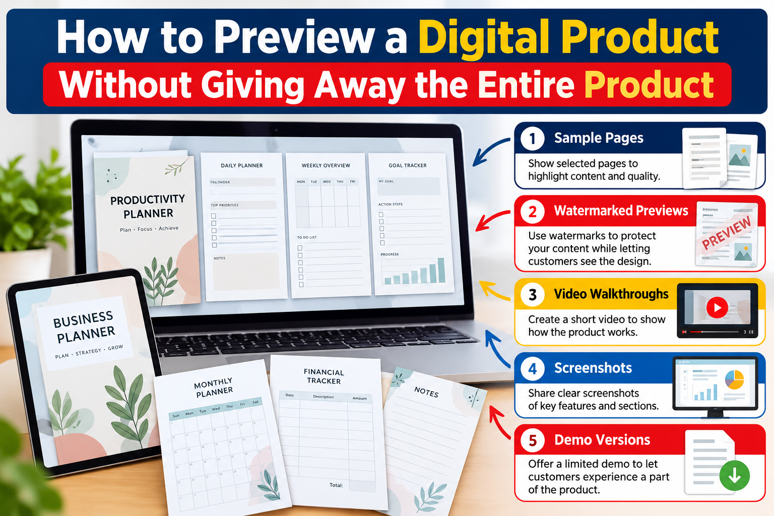
That is why sample pages, watermarked previews, screenshots, video walkthroughs, and demo versions can be powerful sales tools.
Whether you sell ebooks, printable planners, Canva templates, spreadsheets, online courses, worksheets, digital art, business kits, presentation templates, Notion systems, prompt collections, educational resources, or other downloadable products, the right preview can turn uncertainty into confidence without exposing the entire product.
What Is a Digital Product Preview?
A digital product preview is a limited representation of a downloadable or online product that allows prospective customers to evaluate its design, structure, quality, features, or usability before purchasing.
The preview may include:
- Selected sample pages
- Product screenshots
- Watermarked images
- Short video walkthroughs
- Interactive demonstrations
- Limited demo files
- Partial templates
- Table-of-contents previews
- Before-and-after examples
- Close-up feature images
- Mockups showing how the product is used
The purpose is not to deliver the complete experience for free.
The purpose is to provide enough evidence for the customer to make an informed buying decision.
Think of your preview as a shop window. Customers should be able to understand what is inside without being able to remove everything from the store.
Why Product Previews Matter So Much for Digital Downloads
Buying a physical product is relatively familiar. Customers can often inspect photographs, dimensions, materials, packaging, reviews, and specifications.
Digital products can feel less tangible.
A buyer looking at a $19 workbook may wonder whether it contains five useful pages or eighty detailed pages.
Someone considering a spreadsheet template may wonder whether it is professionally automated or simply a basic table they could create themselves.
A customer considering an ebook may want to know whether the writing is genuinely useful or filled with generic information.
These uncertainties create friction.
A well-designed digital download sample reduces that friction because it replaces promises with evidence.
Instead of saying:
“This planner is beautifully designed and easy to use.”
You can show several planner pages.
Instead of saying:
“This spreadsheet automatically calculates your monthly expenses.”
You can show a screenshot or short demonstration of the calculation dashboard.
Instead of saying:
“This course contains practical lessons.”
You can provide a short lesson preview or video walkthrough of the student dashboard.
The customer can see the value rather than being asked to imagine it.
The Core Principle: Show the Experience, Not the Entire Asset
One of the most useful principles in product preview strategy is:
Show customers what owning the product feels like without giving them everything they would receive after purchasing.
For example, imagine that you sell a 120-page digital business planner.
You do not need to display all 120 pages.
You might show:
- The cover
- The contents page
- One goal-planning page
- One monthly planning page
- One financial tracker
- One project worksheet
- A close-up of the page design
- A mockup showing several additional pages partially visible
A potential customer now understands the visual style, organization, usefulness, and overall quality without gaining access to the complete planner.
That is a strong preview.
1. Use Sample Pages Strategically
Sample pages are one of the easiest and most effective ways to preview ebooks, workbooks, planners, templates, educational resources, printables, journals, guides, and PDF products.
The mistake many sellers make is either showing almost nothing or randomly selecting pages.
Your sample pages should be intentional.
Choose Pages That Demonstrate Different Types of Value
If you sell a 50-page workbook, displaying five pages that look almost identical does not tell the customer very much.
Instead, choose pages that demonstrate variety.
For example, a business workbook preview might include:
- Introduction page
- Strategy worksheet
- Customer research page
- Financial planning page
- Progress tracker
A children’s activity bundle might show:
- Coloring activity
- Matching activity
- Puzzle worksheet
- Number exercise
- Writing practice sheet
The buyer quickly understands the breadth of the product.
Do Not Automatically Show the Most Valuable Page
Some digital products contain a particular page, formula, checklist, prompt, framework, or template that represents a substantial part of their value.
You do not always need to reveal it completely.
You could show:
- A cropped section
- A blurred portion
- A partially completed example
- A reduced-resolution version
- A watermarked version
The goal is to demonstrate quality while preserving the reason to purchase.
2. Create Watermarked Previews
Watermarks are particularly useful for visual digital products.
They can help sellers display larger portions of an asset while making direct reuse less convenient.
Common products that benefit from watermarked previews include:
- Printable wall art
- SVG files
- Clipart
- Photography
- Digital illustrations
- Coloring pages
- Worksheets
- Canva templates
- Invitations
- Social media templates
- Presentation templates
- Digital papers
- Graphic bundles
A watermark might contain your business name, website name, logo, or the word “PREVIEW.”
Make the Watermark Visible but Not Distracting
A watermark should protect the preview without making the design impossible to evaluate.
If it covers every detail, the customer cannot properly see the product.
Instead, consider:
- Semi-transparent watermarking
- Repeated diagonal marks
- One large centered watermark
- Smaller brand marks across the page
Customers should still be able to evaluate the quality.
Watermarking Is a Deterrent, Not Perfect Protection
A watermark can discourage casual copying, but no preview method can completely prevent screenshots or unauthorized use.
For that reason, combine watermarking with smart preview selection.
Do not expose an unnecessary amount of high-resolution content simply because it has a watermark.
3. Use Screenshots to Explain Features Quickly
Screenshots are extremely effective when selling products with dashboards, interfaces, editable templates, automation, navigation, or complex layouts.
They work particularly well for:
- Excel templates
- Google Sheets tools
- Notion templates
- Canva templates
- Software products
- Membership areas
- Course dashboards
- Website templates
- Digital planners
- Apps
- Productivity systems
Suppose you sell a financial spreadsheet.
Instead of uploading a generic image of a laptop, show real screenshots of:
- Expense tracker
- Monthly dashboard
- Income section
- Automated charts
- Budget summary
- Annual overview
These screenshots answer a much more important question:
“What will I actually be using?”
Turn Screenshots Into Mini Sales Messages
Do not simply upload screenshots without context.
Each screenshot can communicate a specific benefit.
For example:
Monthly Dashboard
See income, expenses, savings, and budget performance in one place.
Automated Expense Tracker
Enter transactions once and let the spreadsheet organize your totals.
Annual Overview
Review financial trends across the year without building your own calculations.
Now the screenshot is doing more than displaying the product.
It is explaining why the feature matters.
4. Record a Short Video Walkthrough
For many digital products, a video walkthrough provides something static images cannot: context.
A video allows buyers to see how different parts of the product work together.
Imagine selling a Notion business management template.
Screenshots can show the dashboards.
A 60- to 120-second video can demonstrate:
Open dashboard → select project → add task → change status → view calendar → return to overview.
The customer now understands the experience.
Products That Work Especially Well With Video Previews
Consider video walkthroughs for:
- Online courses
- Digital planners
- Notion templates
- Canva templates
- Spreadsheet systems
- Membership libraries
- Website themes
- Software tools
- Design bundles
- Business kits
- Editable presentations
- Large resource libraries
Keep the Video Focused
A preview video does not need to become a complete tutorial.
The purpose is to create understanding and confidence.
A simple structure can work extremely well:
First 10 seconds: What the customer is viewing.
Next 30–60 seconds: Show the major features.
Next 20–30 seconds: Demonstrate one useful action.
Last 10 seconds: Explain what is included with purchase.
The buyer should finish the video thinking:
“Now I understand what I am getting.”
Not:
“I just learned everything, so I no longer need the product.”
5. Offer a Limited Demo Version
Some products benefit from something more interactive than screenshots.
This is where a demo version can become powerful.
A demo allows the customer to experience part of the product without accessing the complete package.
For example, if you sell a 200-template collection, you could offer three sample templates.
If you sell a 12-month spreadsheet system, you could create a simplified one-month demo.
If you sell a digital planner, you could allow users to test five sample pages.
If you sell an educational resource library, you could provide one sample lesson.
If you sell presets or design assets, you could provide a small sample pack.
The demo should demonstrate the experience while intentionally limiting the amount of usable content.
A Useful Demo Formula
Consider using:
Full product: 100% of the experience
Preview/demo: Enough to understand approximately 5–10% of the experience
The exact percentage will depend on your product.
For some products, even one sample is enough.
What matters is preserving the customer’s reason to upgrade from the demo to the full product.
6. Show the Table of Contents or Product Index
One of the easiest ways to demonstrate depth without giving away content is to show its structure.
This works particularly well for:
- Ebooks
- Courses
- Guides
- Prompt collections
- Resource libraries
- Templates
- Business kits
- Workbooks
- Training programs
Imagine selling an ebook containing 25 chapters.
You could display the complete chapter list while providing only two or three sample pages.
The reader sees how comprehensive the product is without receiving the information contained inside every chapter.
For a course, display:
Module 1: Foundation
Module 2: Research
Module 3: Planning
Module 4: Creation
Module 5: Marketing
Module 6: Sales
Module 7: Automation
Then preview one lesson.
Structure communicates value surprisingly well.
7. Use Product Mockups to Show Context
A digital file can appear abstract when presented as a flat PDF thumbnail.
Mockups help customers imagine using it.
For example:
An ebook can appear on a tablet.
A printable can appear inside a frame.
A workbook can appear as several pages spread across a desk.
A course can appear on a laptop screen.
A mobile planner can appear inside a smartphone.
A presentation template can appear on a monitor.
Mockups are useful because they visually communicate the product category immediately.
However, there is an important rule:
Do Not Let Mockups Replace Real Previews
A beautiful laptop mockup may attract attention, but customers still need to see the actual product.
Use mockups for presentation.
Use screenshots and sample pages for proof.
Both serve different purposes.
8. Show Close-Up Details
Sometimes customers need to see the small details.
Consider including close-up previews showing:
- Typography
- Icons
- Navigation
- Editable fields
- Spreadsheet formulas
- Page structure
- Illustration quality
- Printable resolution
- Template elements
- Dashboard components
A combination of full-page and close-up images makes a preview feel much more complete.
9. Use Before-and-After Demonstrations
Transformation-based products can be especially persuasive when customers see what changes.
For example:
Before: Empty content calendar
After: Organized monthly content system
Before: Raw financial data
After: Visual budget dashboard
Before: Plain social media post
After: Professionally designed Canva template
Before: Disorganized project tasks
After: Structured Notion project dashboard
This preview strategy focuses attention on outcomes instead of files.
That can be particularly helpful when the digital product saves time, simplifies a process, improves organization, or provides a professional structure.
10. Preview the Product in Layers
You do not need one enormous preview image.
Instead, take customers through several layers of information.
A strong product page might follow this sequence:
Hero image: Show the complete concept.
Image 2: What is included.
Image 3: Sample pages.
Image 4: Feature close-ups.
Image 5: Before-and-after example.
Image 6: Product dimensions or specifications.
Image 7: How the product works.
Image 8: Video walkthrough.
Image 9: Frequently asked questions.
Each layer answers another buying question.
This approach can be much more persuasive than placing everything into one crowded promotional graphic.
What Information Should Never Be Missing From a Digital Product Preview?
Even a visually attractive preview may fail if basic purchase information is unclear.
Your sales page should communicate:
- File format
- Number of files
- Number of pages or templates when applicable
- File dimensions
- Software requirements
- Whether an account is required
- Whether the product is editable
- Whether the product is printable
- What is included
- What is not included
- How the customer receives the files
- Usage or licensing terms
- Compatibility requirements
Reducing uncertainty can be just as important as displaying beautiful samples.
How Much of a Digital Product Should You Preview?
There is no universal number.
The right amount depends on the type and size of product.
For a 300-page ebook, showing 8–12 pages may be perfectly reasonable.
For a 10-page printable, showing eight complete pages could reveal too much.
For a 5,000-template bundle, showing 20–50 thumbnail examples may reveal only a tiny fraction of the package.
For a three-template premium package, showing all three templates in full detail might significantly reduce the need to purchase.
Instead of asking:
“How many pages should I show?”
Ask:
“Can the customer confidently understand the product without receiving enough content to replace the purchase?”
That question produces much better decisions.
The Preview-to-Value Balance
A strong preview sits between two problems.
Too Little Information
The customer thinks:
“I can’t tell what I’m buying.”
Result: hesitation.
Too Much Information
The customer thinks:
“I already got what I needed.”
Result: reduced purchase motivation.
The Ideal Preview
The customer thinks:
“I can clearly see that this is exactly what I need, and I want access to the rest.”
That is the target.
Create Curiosity Without Becoming Misleading
Curiosity can be useful in marketing, but it should never require hiding essential product information.
For example, you might show:
“Includes 50 additional business planning templates.”
But customers should still understand what type of templates those are.
You could show thumbnail previews of many pages while enlarging only several.
You could display part of a checklist while stating that the complete checklist contains 75 items.
You could demonstrate three features of a system while explaining that the full version includes ten.
Curiosity works best when it expands interest rather than creates confusion.
Product Preview Strategy for Different Digital Products
Ebooks
Use:
Cover mockup, table of contents, introduction, selected sample pages, chapter snippets, author information, and a few highlighted insights.
Avoid publishing complete chapters if those chapters represent a significant portion of the book’s value.
Printable Bundles
Use:
Thumbnail grids, 5–10 enlarged pages, watermarked previews, mockups, page count, printable sizes, and close-up examples.
Canva Templates
Use:
Completed example designs, template thumbnails, editable element demonstrations, and a short editing video.
Spreadsheet Templates
Use:
Dashboard screenshots, input sections, automated output examples, charts, sample data, and a short screen recording.
Online Courses
Use:
Curriculum, module list, dashboard screenshot, instructor introduction, one short lesson preview, and sample learning resources.
Digital Art
Use:
Watermarked images, room mockups, close-up details, available dimensions, file types, and print examples.
Prompt Collections
Instead of publishing dozens of complete prompts, show several representative examples from different categories and explain the structure of the complete library.
Notion Templates
Use:
Dashboard screenshots, database views, workflow demonstrations, mobile views, navigation structure, and a video walkthrough.
Add CTAs at Natural Decision Points
A call to action works best after the reader or customer has received enough information to act.
Instead of repeatedly writing:
“BUY NOW!”
use benefit-led CTAs.
For example:
See Everything Included in the Complete Bundle
Get Instant Access to the Full Template Library
Explore the Complete Digital Planner
Start Using the Full System Today
Download the Complete Resource Pack
Unlock All Templates and Features
View the Full Collection
These CTAs tell the customer what happens next.
Use a CTA After Your Strongest Preview
Imagine your product page includes:
Headline
Benefit summary
Preview images
Feature explanation
Video walkthrough
Customer information
CTA
The video walkthrough may be the moment when purchase uncertainty disappears.
That is an excellent place for a CTA.
Another strong location is immediately after an “Everything Included” section.
Customers have just confirmed what they are receiving.
Give them a clear next action.
Digital Product Preview SEO Strategy
Preview content can also contribute to organic visibility when the page contains useful text surrounding the images and video.
Instead of publishing a page made almost entirely of promotional graphics, explain what customers are seeing.
For example:
“This digital budget planner includes monthly income tracking, expense categorization, savings planning, annual summaries, and printable financial worksheets.”
That sentence gives customers information while naturally giving search engines useful context.
Relevant semantic terms might include:
digital product preview
digital download sample
product preview strategy
digital product sample
downloadable product preview
product demonstration
sample pages
watermarked preview
digital product screenshots
video product walkthrough
demo version
digital download example
template preview
ebook sample pages
printable preview
online product demo
digital product marketing
digital product sales page
product listing images
digital product presentation
Do not force every keyword into the page.
Use terms when they genuinely help explain the subject.
Write for Search Intent, Not Just Keywords
Someone searching for how to preview a digital product probably wants a practical solution.
Someone searching for digital download sample may want examples of how much of a downloadable product should be displayed.
Someone searching for product preview strategy may be looking for ways to improve conversions without giving away premium content.
A strong article should answer all three intentions naturally.
That is more useful than repeating the same keyword twenty times.
GEO: Make Your Content Easy for AI Systems to Understand
Generative search experiences often benefit from information that is clearly structured and easy to extract.
That means your article should contain direct answers, clear definitions, descriptive headings, concrete examples, comparisons, and concise explanations.
For example:
What is a digital product preview?
A digital product preview is a limited representation of a downloadable or online product that allows potential buyers to evaluate its appearance, features, quality, or usability before purchasing.
That kind of passage works for humans because it is clear.
It is also machine-readable because the question and answer are explicit.
Other helpful practices include:
- Use descriptive headings
- Answer important questions directly
- Explain technical terms
- Include real examples
- Keep paragraphs readable
- Demonstrate expertise rather than padding word count
- Update information when products or platforms change
Make Your Preview Visually Search-Friendly
Search is increasingly visual, which makes original product imagery even more valuable.
Create preview images that clearly show the actual product rather than relying entirely on decorative stock photography.
Whenever possible, use:
- Sharp high-resolution images
- Relevant visuals
- Descriptive file names
- Useful alt text
- Multiple image formats suitable for different placements
- Fast-loading optimized files
- Mobile-friendly layouts
For article publishing, Google currently recommends relevant high-resolution imagery and supports multiple representative aspect ratios through Article structured data. Google also clarified in 2026 that og:image and schema metadata may help identify preferred imagery for Search and Discover.
Google Discover Considerations
No publisher can guarantee placement in Google Discover.
However, content is better positioned when it offers genuine usefulness and strong visual presentation rather than relying on artificial clickbait.
For an article about digital product previews, an effective featured image might visually demonstrate:
Preview Enough to Sell — Not Enough to Give It Away
The visual could include an ebook, template pages, video preview screen, watermark icon, and digital product mockup.
The article itself should deliver on that promise immediately.
A compelling title may attract the click.
Useful content earns the reader’s attention afterward.
Page experience also matters. Google advises site owners to consider the overall experience, including mobile usability, secure delivery, Core Web Vitals, avoiding excessive intrusive advertising, and making the primary content easy to identify.
A Practical Digital Product Preview Formula
Here is a simple framework you can adapt:
Step 1: Show the Product
Use one strong hero image.
Step 2: Explain What Is Included
List the major components.
Step 3: Prove the Quality
Show several sample pages or screenshots.
Step 4: Demonstrate How It Works
Add a video walkthrough or animated demonstration when appropriate.
Step 5: Protect Premium Content
Use selective previews, cropping, lower-resolution display copies, partial examples, or watermarks where useful.
Step 6: Explain Specifications
Clearly state formats, dimensions, compatibility, editing requirements, and licensing.
Step 7: Answer Objections
Add frequently asked questions.
Step 8: Provide the Next Action
Place a clear CTA after the buyer has enough information to decide.
Example: Previewing a 500-Template Business Bundle
Suppose you sell a collection containing 500 business templates.
Instead of displaying all 500 files individually, your product page could include:
A hero mockup showing the collection.
A category graphic showing:
- Marketing templates
- Finance templates
- Planning templates
- Sales templates
- Social media templates
- Productivity templates
Then show 15–20 selected examples.
Follow with a 60-second video scrolling through the organized folders.
Next, provide screenshots of five templates in detail.
Then state:
500+ editable templates included in the complete bundle.
Finally:
Get Instant Access to the Complete Template Library
The customer understands the scale, quality, organization, and usefulness without receiving the files themselves.
Example: Previewing an Ebook Without Publishing Half the Book
Suppose your ebook has 180 pages.
A strong preview might contain:
- Front cover
- Back cover
- Contents page
- Author introduction
- 5–8 sample pages
- Two short chapter excerpts
- Several highlighted quotations
- A graphic listing major topics
- 3D book mockup
Instead of exposing complete sections, choose samples that demonstrate writing quality and depth.
The preview should create the reaction:
“If these pages are this useful, I want to read the rest.”
Example: Previewing a Spreadsheet
Suppose your spreadsheet contains an advanced business finance system.
Show:
- Main dashboard
- Revenue tracker
- Expense tracker
- Profit-and-loss summary
- Monthly chart
- Annual reporting page
Then create a 45-second walkthrough showing data being entered and the dashboard updating.
The customer now sees the practical advantage of the template.
There is far less need to give away the spreadsheet itself.
Mistakes to Avoid
Showing Only Mockups
Mockups look professional but may not prove what the product contains.
Include real screenshots or pages.
Using Tiny, Unreadable Previews
Customers should be able to inspect quality.
Do not make every sample so small that it becomes meaningless.
Giving Away Your Core Asset
If one file represents the primary value of the product, think carefully before making the entire file downloadable as a sample.
Hiding Important Information
Do not hide file types, page counts, compatibility, usage requirements, or license restrictions.
Mystery is not a substitute for clarity.
Over-Watermarking Everything
A watermark should protect the product, not destroy the shopping experience.
Making the Demo Too Complicated
A prospective customer should not need a 30-minute tutorial simply to understand the product.
Keep your preview focused.
Making Claims the Preview Cannot Support
If you describe your product as highly detailed, show evidence of that detail.
If you say there are hundreds of templates, demonstrate the range.
Trust grows when the preview supports the sales message.
The Most Effective Preview Is Built Around Buyer Questions
Instead of asking:
“What should I upload to my product listing?”
Ask:
“What does the buyer still need to know before feeling comfortable purchasing?”
Their questions might include:
What exactly is included?
What does it look like?
How detailed is it?
Can I edit it?
What software do I need?
How does it work?
Can I print it?
How will I receive it?
What am I allowed to do with it?
When your preview answers those questions, it becomes part of the selling process instead of simply being decoration.
5 Frequently Asked Questions About Digital Product Previews
1. How much of a digital product should I show before purchase?
Show enough content for customers to understand the product’s quality, style, structure, and usefulness without revealing enough material to replace the need for the full product. The ideal amount varies according to product size, value, and format.
2. Should I watermark digital product preview images?
Watermarks can be useful for artwork, printables, worksheets, templates, photography, and other highly reusable visual products. Keep the watermark visible enough to discourage casual copying but transparent enough for customers to evaluate the design.
3. Are screenshots better than product mockups?
They serve different purposes. Mockups help customers imagine the product in context, while screenshots prove what the actual product looks like. Using both is often more effective than relying on either alone.
4. Should I provide a free demo of my digital product?
A demo can be valuable when customers need to experience the product before understanding its value. Templates, software, spreadsheets, online courses, digital planners, and productivity systems are particularly suitable. Limit the demo so that purchasing the complete product still provides substantial additional value.
5. Can video walkthroughs help sell digital downloads?
Yes. A short walkthrough can make complex digital products easier to understand by showing navigation, features, workflow, or editable elements in action. Keep it focused on demonstrating value rather than teaching the entire product.
Turn Your Preview Into a Reason to Buy
The strongest digital product previews do something simple but powerful:
They replace uncertainty with evidence.
Customers can see the design.
They can understand the features.
They can evaluate the quality.
They know what they will receive.
They can imagine using the product themselves.
At the same time, enough premium value remains behind the purchase to make owning the full product worthwhile.
That balance is the heart of a successful digital product preview strategy.
Use sample pages to demonstrate depth. Use watermarked previews when visual protection matters. Use screenshots to prove functionality. Use video walkthroughs to explain the experience. Use limited demos when customers benefit from interacting with the product.
Then connect everything with clear descriptions, accurate specifications, useful FAQs, and a compelling next step.
A digital preview should never attempt to reveal everything.
It should reveal exactly enough for the right customer to say:
“I understand what I’m getting—and I want the complete version.”
Ready to improve your product listing? Create a preview that demonstrates the value, protects your premium content, and gives customers the confidence to choose the complete product.
Stay ahead with exclusive updates
Join our community. Get curated industry trends, actionable guides, and fresh resources delivered straight to your inbox.